"You are not a beautiful and unique snowflake." — Fight Club
Artistic expression is great. But do you know what's greater? Making a buck.
And for that, your customers have to know what to do. They need to land on your site and immediately understand where they are, what you offer, and what step to take next.
You don't want some envelope-pushing artistic ad agency building your site. Or maybe you do — but that's not uplevers.com. We build clear, focused, conversion-oriented sites. That means doing the expected, and doing it well.
Flair is great. Once you have the fundamentals. So let's cover those.
Before We Dive In
Each page on a business website has design elements you're going to want to know about. Headers, logos, navigation menus, URL conventions, "slugs" — there's a lot of depth here.
This article is meant to be informative and useful, not comprehensive. We're covering the fundamentals so you know what you're looking at and what to ask for.
Shared Components
These elements show up across multiple pages. Learn them once, recognize them everywhere.
Hero
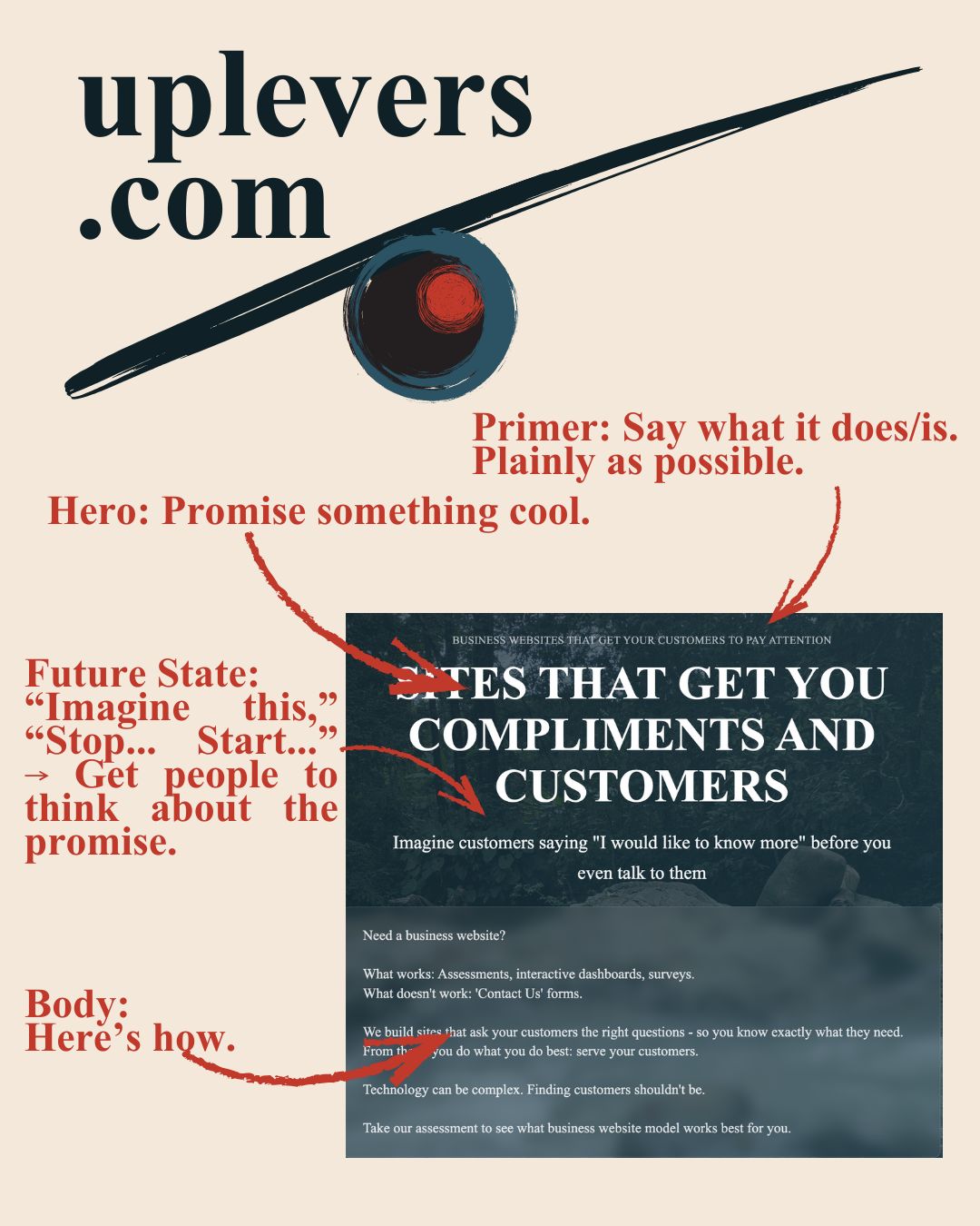
The big, bold section at the top of a page. Usually includes a headline, subheading, and a call to action. This is your first impression — it needs to communicate value immediately.
Headline
The main text that grabs attention. Short, clear, benefit-focused. This is not the place to be clever. Say what you do or what the customer gets.
Subheading
Supports the headline. Adds context or detail. If the headline is "We Fix Leaky Roofs," the subheading might be "Fast, affordable repairs for homeowners in Austin."
Body
The regular text content. Explains, elaborates, persuades. Keep it scannable — short paragraphs, clear language.
Primer / Lead-in
A short sentence or phrase that sets up what's coming next. Often appears above a headline to provide context. "For homeowners who are tired of calling unreliable contractors..."
CTA (Call to Action)
The thing you want people to do. A button, a link, a form. "Get a Free Quote." "Book a Call." "Take the Assessment." Every page should have one. Make it obvious.
Testimonials / Social Proof
Quotes from real customers. Logos of companies you've worked with. Reviews. "Don't take our word for it — here's what others say." Builds trust.
Numbers / Statistics
Confidence indicators. "500+ projects completed." "98% customer satisfaction." "Serving Austin since 2015." Concrete numbers feel more credible than vague claims.
Images / Media
Photos, videos, graphics. Show your work, your team, your product. Stock photos are fine, but real photos are better. People trust faces.
Navigation
The menu that lets people move around your site. Usually at the top. Keep it simple — too many options overwhelm. Homepage, Services, About, Contact is often enough.
Footer
The bottom of every page. Usually includes contact info, links to key pages, social media icons, legal stuff. Not glamorous, but necessary.
The Pages
Every business website has some version of these. Not every business needs all of them, but you should know what they are.
Homepage
Your front door. Introduces who you are, what you do, and why someone should care. Usually includes a hero, some social proof, and a clear CTA. This page does the heavy lifting.

source: very good copy
Services
What you offer. Can be one page or multiple pages if you have distinct service lines. Be specific — vague descriptions don't convert.
Pricing
What it costs. Some businesses put this on the Services page. Some hide it entirely (not recommended). Transparency builds trust.
Portfolio
Your work. Case studies, before/after photos, project summaries. Shows you've done this before and can do it again.
Testimonials
Social proof, expanded. A dedicated page for customer quotes, reviews, video testimonials. Useful if you have a lot of them.
About Us
Who you are. Your story, your team, your values. People buy from people. This page humanizes your business.
Blog
Your content hub. Articles, guides, updates. Good for SEO, good for establishing expertise. Only worth having if you'll actually update it.
Contact
How to reach you. Form, phone number, email, address, map. Make it easy. Don't make people hunt for this.
Lead Magnet / CTA Page
A dedicated page for your assessment, calculator, free guide, or whatever you're offering. This is where you capture leads. Often the most important page on your site.
What's Coming
Now that you know the anatomy, we can start talking about what makes each piece actually work. What separates a homepage that converts from one that just sits there?
That's next.
Recap
- Fundamentals before flair — do the expected, do it well
- Shared components — hero, headline, CTA, social proof, etc. show up everywhere
- The pages — homepage, services, pricing, portfolio, testimonials, about, blog, contact, lead magnet
- Every page needs a CTA — tell people what to do next

