
Your site is not your business. It's a door. A front door.
Something interesting happens when you think about the front door of your business. You immediately ask: What experience do I want my customer to have when they are here?
This gives you a chance to think about the paint, carpeting, finishes, furnishings, sure. That's how it looks and feels. But how does it function?
Have you ever been to an office with something obstructing the entryway? I think about COVID lockdown times, where we had those screens put up everywhere. Did that make doing business more fun? Did it make you want to do more business like that?
Not me.
To me, a proper site should be like a well-organized office. Not only does it look and feel like you expect — it's easy to find the coffee or the bathroom — but it also helps with the business of the business. That is to say, the way the business operates.
If you're an SMB owner, solopreneur, or just someone learning to make websites for great comms, I hope you'll find this article useful.
Bad Websites
Understanding what makes a website bad is as important as what makes it good.
Picture walking into an office. Half-opened boxes piled up in the corner. Coffee rings on dusty coffee tables. Papers scattered. The receptionist isn't sure where to direct you.
It sets an impression.
What makes a website feel "bad" or untrustworthy?
It feels confusing / inconsistent. You land on the page and don't know what the business does. Or worse, you can't find what you came for.
Lack of structure and consistency. Information scattered everywhere. Important details buried. Three different fonts. Colors that don't match. It feels like nobody's minding the shop.
You can't tell if the site is still being used. Copyright 2019 in the footer. Blog posts from two years ago. "Coming soon" sections that never came. It makes you wonder: Is this business still open?
Slow or clunky / obstructive. You click and wait. Things load... eventually. Or the experience trying to use the site is frustrating. You don't trust that it's working how it should.
Boring. Modern marketing has taught us: we have to make it about the CUSTOMER. This means getting attention with free information, interactive elements, or just great writing. Boring websites have no "pop." That's a shame because it's how we show customers who YOU are.
Your website is the first impression. A messy office tells visitors: This business doesn't have its act together.
A clean, organized site tells them: We're ready for you. We respect your time. We know what we're doing.
Good Websites
I've been asking business owners. Business owners say good sites make good money.
So, how does a website make money? It communicates the business' value, clearly, to the right audience. It compels the right audience to signal interest in your offering. You're looking for interest signals.
Some people make lots of money by driving people to the edge of their comfort zone. We are not these people. We want to make lots of money by giving people EXACTLY what they expect so that we can focus on selling rather than showing off our own idea of a good website.
So, a good business website should be, generally, what people expect from a business website.
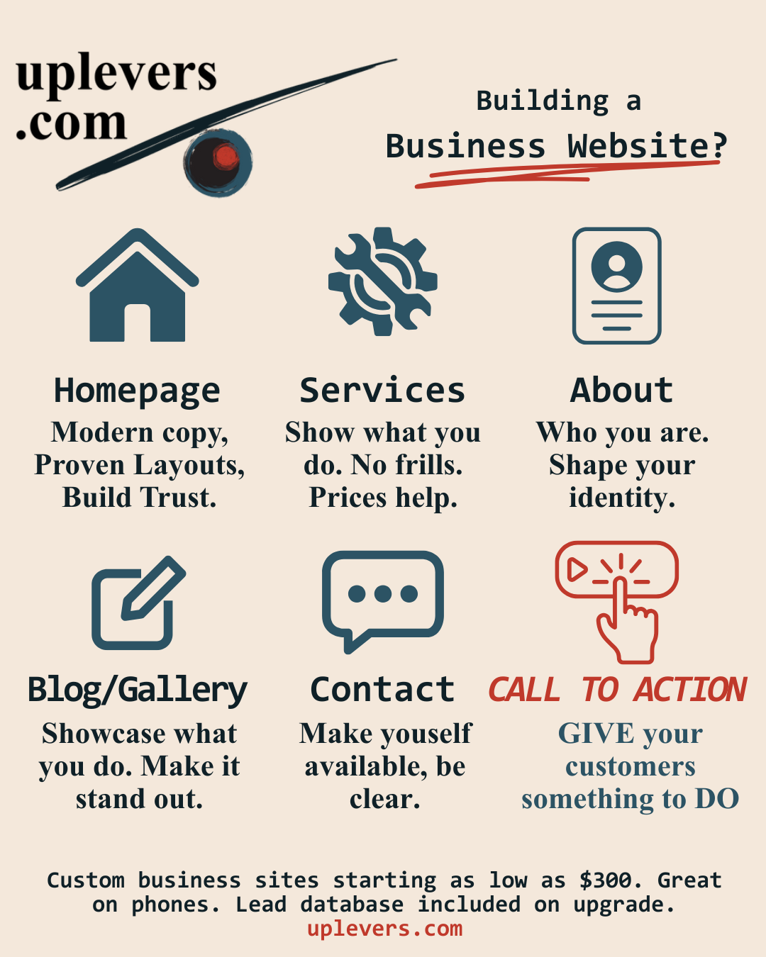
Business websites should generally have the following sections:
What you do — Home / Landing Page (/)
This is where a visitor comes if they just "go to your webpage."
How you do it — Services (/services)
This is where a visitor clicks if they want to learn about specifics, usually based on what they saw on the landing page.
Who you are — About (/about)
This is where you share WHO you are.
Stuff you've done — Blog / Gallery / Resources
These are pages that show customers how you can help them. This is important: how YOU can help the CUSTOMER. For example, I am writing this because I build internet technology systems.
How to reach you — Contact Info (/contact)
Include multiple channels.
What to do — Call to Action
This is something your user can DO to be more engaged with your business, like signing up for a newsletter, taking assessments, all sorts of fun stuff.
Now that we have an idea of the pages our site needs to include, we'll go into more detail about each one.
Home / Landing Page
This is the page that AI and Google will find first. It's the URL you put on your business cards and social media profiles. This is the modern edifice to your business, the front that people see first.
I like to use advertising principles I learned from verygoodcopy.com.
The above-the-fold section of the homepage should include:
Primer text — Small text above the headline. This is the "plain words that say what we do" principle. You want to make things as clear to your reader as possible.
Headline — The promise (or hint of promise) of what your customers can enjoy if they buy your product.
Future state — A subheading encouraging your customer to think about the benefits they'll enjoy.
Body — This is the proof, the "explain yourself" part.
Call to Action (CTA) — Now DO something!
After the Hero
It's good to show some educational or supporting statistics. Statistics specific to your business are better, such as "24% average increase in lead volume." But informational stats can work too.
Why stats? Because something about seeing numbers increases our confidence in what we see. Specific numbers, like 27, tend to work better than vague ones, like "about 30."
Guarantees
After statistics, a guarantee or promise can help your customer choose to buy. Your guarantee should honestly reduce the risk your customer experiences with buying your product, service, or whatever else.
Testimonials
The more, the merrier. BUT DO NOT MAKE THEM UP! This is something I see a lot of online businesses do and it's wrong. It breaks trust. Keeping customer trust matters to us at uplevers.
Tip: Sprinkle a handful of testimonials through your site as you go. This gives your reader lots of nudges as they scroll down.
Interactive Elements
The next sections of the homepage vary from site to site. An interactive component can be good, as can a video. Product images or demos help a ton.
Wall of Fascinations
One popular section for a homepage: the "wall of fascinations." This is a collection with a bunch of features or benefits your product can impart upon the fortunate customer.
"Grow your business faster with more cashflow."
"Start enjoying ad spend clarity."
The idea here is to overwhelm your customer with all the benefits you offer.
CTAs Throughout
Throughout the landing page, I sprinkle calls to action. I do this because often times, a customer makes a decision and doesn't know where to click next. We want to make sure we're there for them when this happens.
These things work. You build trust and confidence with your customers. You communicate clearly and throw in the little "marketing sauce" that gets website visitors to turn into customers.
Services
Not every business website requires a services page, but I think they make a lot of sense.
Listing your services gives your users a place to go when they think, "this sounds cool, but I have questions. Oh, maybe Services will have what I am looking for...."
On top of that, great business people can structure their service offerings in a way that makes the expensive look reasonable. If I put a $20,280 custom software offer on my services page, you'd probably think that $1,000 sounds like a great deal.
Services can be listed in columns, rows, or tiles. Each service should have a media image, its price, a short description, and a list of comparison points next to your other services. The user should "feel knowledgeable" about the services, even if they've just seen a few.
I like to dedicate a full page to each service, too. This gives your customer a more detailed, contextual view of what you're offering.
Some businesses like to leave price off of their service listings. I'm a pretty big fan of putting price out there, or a "From..." or a range. It seems like knowing what to expect drives customers better. Intrigue is great for lots of marketing; price is not one of them.
That's pretty much it for services. We want to dedicate the page to specificity and clarity.
About / About Us
When people are curious about you, or they want to know more about your business, they click "About."
You'll notice a recurring theme: Great websites are about building trust. The about page is one place where you can do this. By building trust I mean that you're increasing confidence in your user's perception. You're saying, "here's the story of the company and who we are."
The about us page also invites you to share your business purpose or mission. "We want to automate all the boring parts of business tech so you can focus on running your business," for example.
About us pages can feature awards you've won, professional background and accomplishments of the founder or founding team, or just fun, more personable information.
What to Avoid
Irrelevant content. We probably have something in common: We like talking about ourselves. But no, your college GPA does not go on your about me section (unless your business has to do with college GPAs). The about us page should be about your COMPANY, not you. You don't want to lose a sale because you overshare on your website, do you?
Too little content. Pages that have only one or two things on them can either intentionally draw attention to that one thing OR look sparse and incomplete. The first takes a lot of intention, and would be wasted on an About page.
Missing the opportunity. When a customer comes to your about page they are genuinely curious about who you are. Show them who your business is, how you deserve your customers' trust. You started this business because you can take better care of customers than the competition. The about page is your space to tell them so.
That's enough about "about" for now.
Blogs / Galleries / Portfolios / Resources
I'm glossing over these ones too much. Each page is an option for your business, and which one(s) to include is up to you.
Blogs have a storied history on the internet; anyone can start a blog! But business blogs are something different. Business blogs should be carefully crafted to:
- Provide value to your user, and
- Push info about your company and what you do onto the internet
That bit about putting your own content online? That ties into SEO. Which will have to be a different article.
Blogs are amazing, but beware! It's a commitment. If you fall behind on making article updates, you risk making your site look stale and unused! I'm not saying you have to write every day, but if you have more than a few months between blog posts, I don't think your site looks very relevant. Maybe others disagree.
Portfolios and galleries give your customers a great view of what it is that you do. Before/after pictures showcase your work if you do services or something physical. Case studies can also make great portfolio additions.
Again, the purpose remains: Communicate value and trust to your user. By showing the user what you DO, they know they can trust you more.
Contact: How Do I Reach You?
Hopefully you have great messaging with tons of CTAs littered through your site. But if people want to contact you, they are going to scan for the "Contact" page.
The contact page should be clear and no-nonsense. Include your contact info across social media channels. There should be a form. The form should request an email, a (optional or required, up to you) phone number, and a message.
The contact form should send an email to you or your sales team when submitted. An email also alerts the site admins that they have an inquiry.
I like to have "schedule meeting" links, too. These should route to a scheduling tool like Calendly.
The more channels you give your users to reach you, the greater the chance that the user will actually reach out.
Maps are great for physical stores. Having a map looks cool and is VERY useful to end users.
Call to Action
CTAs should not occur in just one place. They should be strewn throughout the site — especially the homepage. We also put a CTA link in the top bar near where people navigate pages.
The CTA should have a distinctive look-and-feel that makes it pop and contrast with the rest of the page. Use your accent color. Make it bold. The user's eye should naturally land on it.
Different CTAs can serve different purposes:
- "Get Started" — for users ready to buy
- "Learn More" — for users still exploring
- "Book a Call" — for high-touch sales
- "Take the Assessment" — for lead magnets
Match the CTA to where the user is in their journey.
Note that "Buy Now" (unless you're selling something cheap) is NOT a great CTA. Why is that? Well, people prefer being offered something for free. Free assessment. Free report. Giving people something awesome for free builds trust. It builds confidence. Help your customers before asking them to commit to business with you.
Conclusion
I hope you found this helpful. It seems like we have all been doing "business websites" for so long now that it helps to take a beat and get to the basics. To think back to "what makes a website effective?"
10 years ago, the answers were very different from today. Today, you need a business website not just to inform that you exist, but also to build trust, provide value, and drive engagement.
Great sites meet the expectations the user has and also provide use and value. Sites should follow some standard patterns because that builds trust and confidence in your customers. You should not make your customer work really hard just to understand your website. Your customer should not have to click around frustrated. You meet their needs right there.
uplevers.com builds business websites that go far beyond the basics. We go deep into SEO, making sites discoverable with AI (so ChatGPT can recommend you to clients). We handle the marketing, tech, and compliance so you can focus on serving your customers.
Want to learn more? Try our FREE assessment to see what website development strategy is right for you.